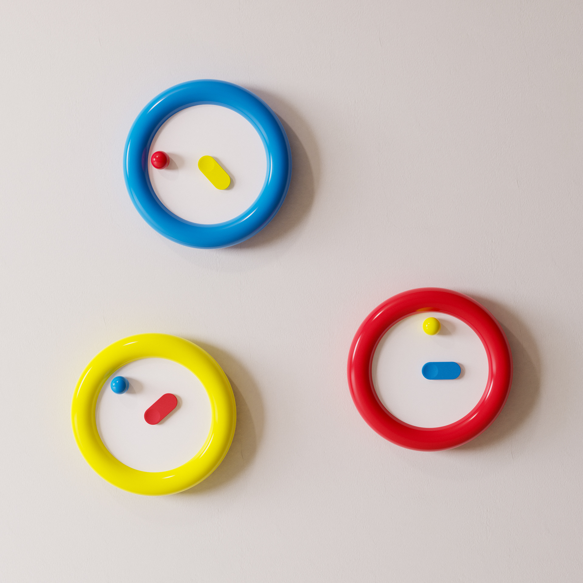
Punctual
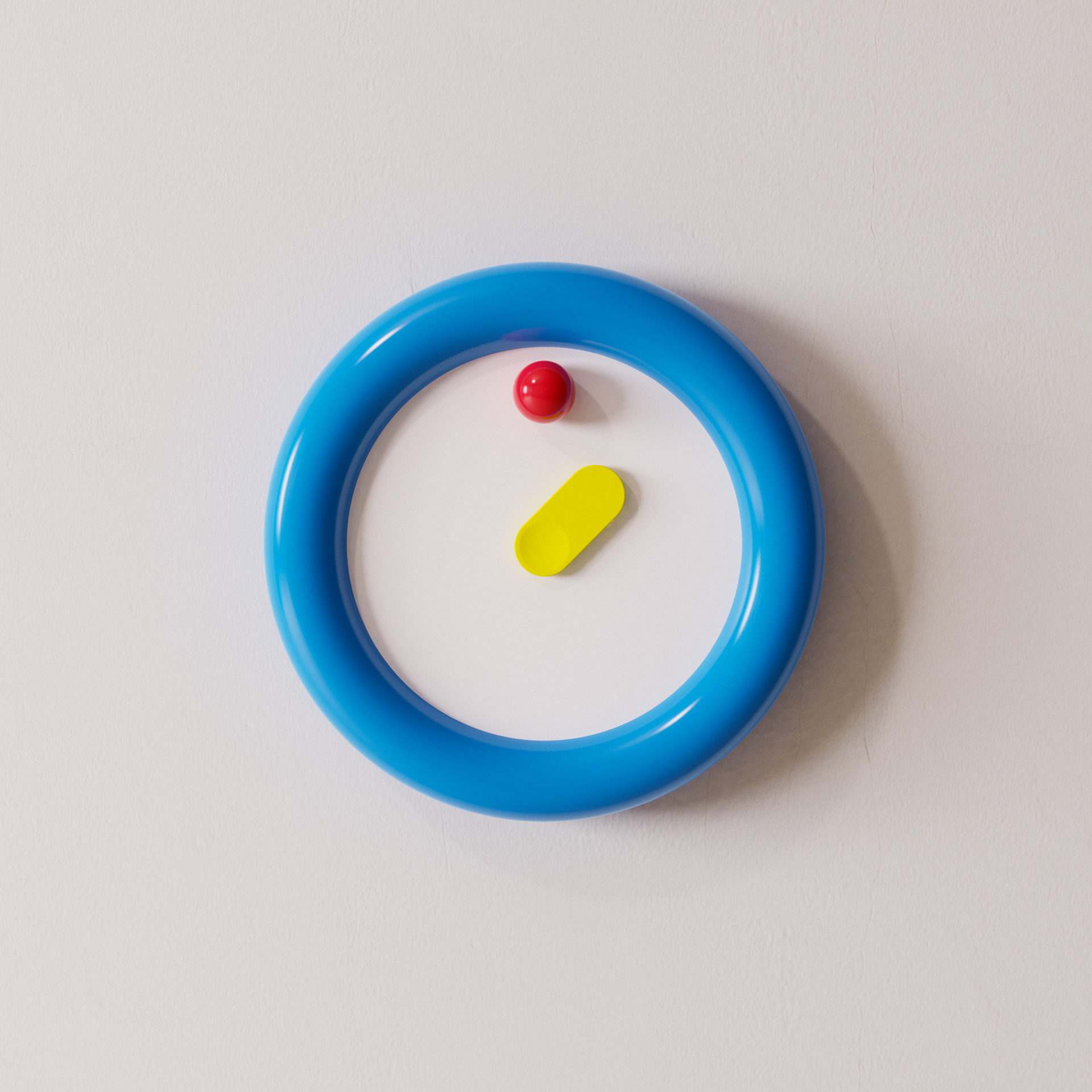
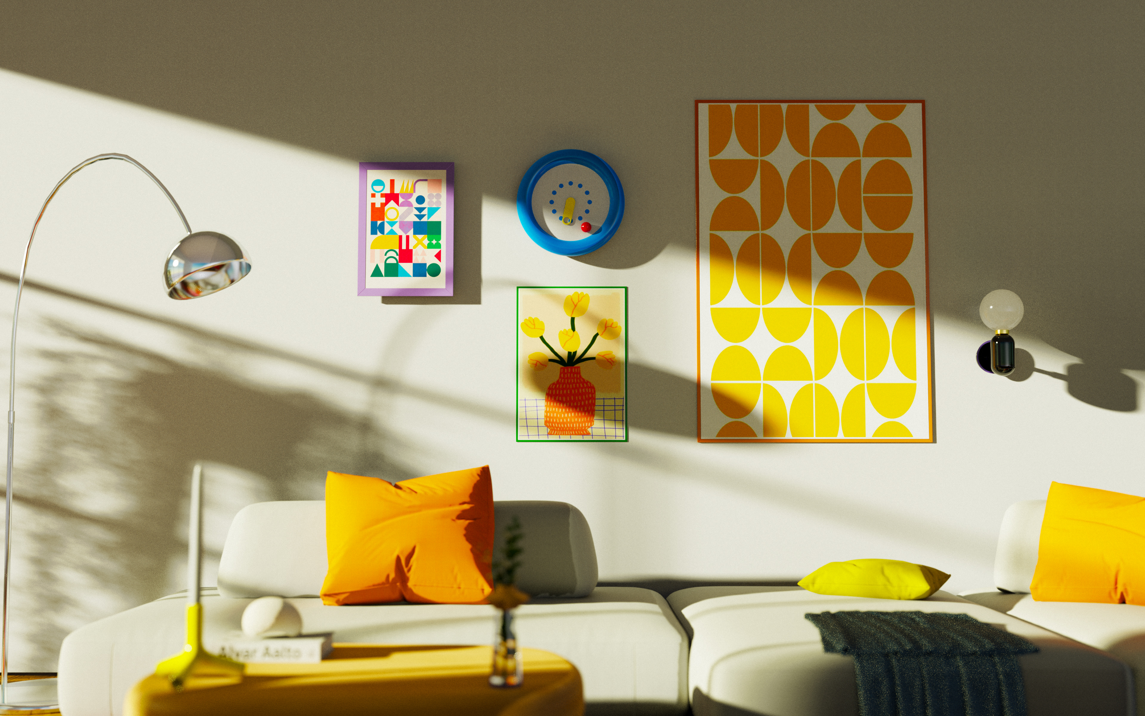
Punctual is a wall clock that blends functional time keeping with playfulness. That was the idea that originally came from a RenderWeekly prompt and into something I could not stop thinking about. I wanted the object to capture your attention playfully, to make you look at it the way you look at a piece of art. Punctual can stand out in a space or settle naturally into a curated collection, holding its own next to other designed objects.
Personal Project: 2026
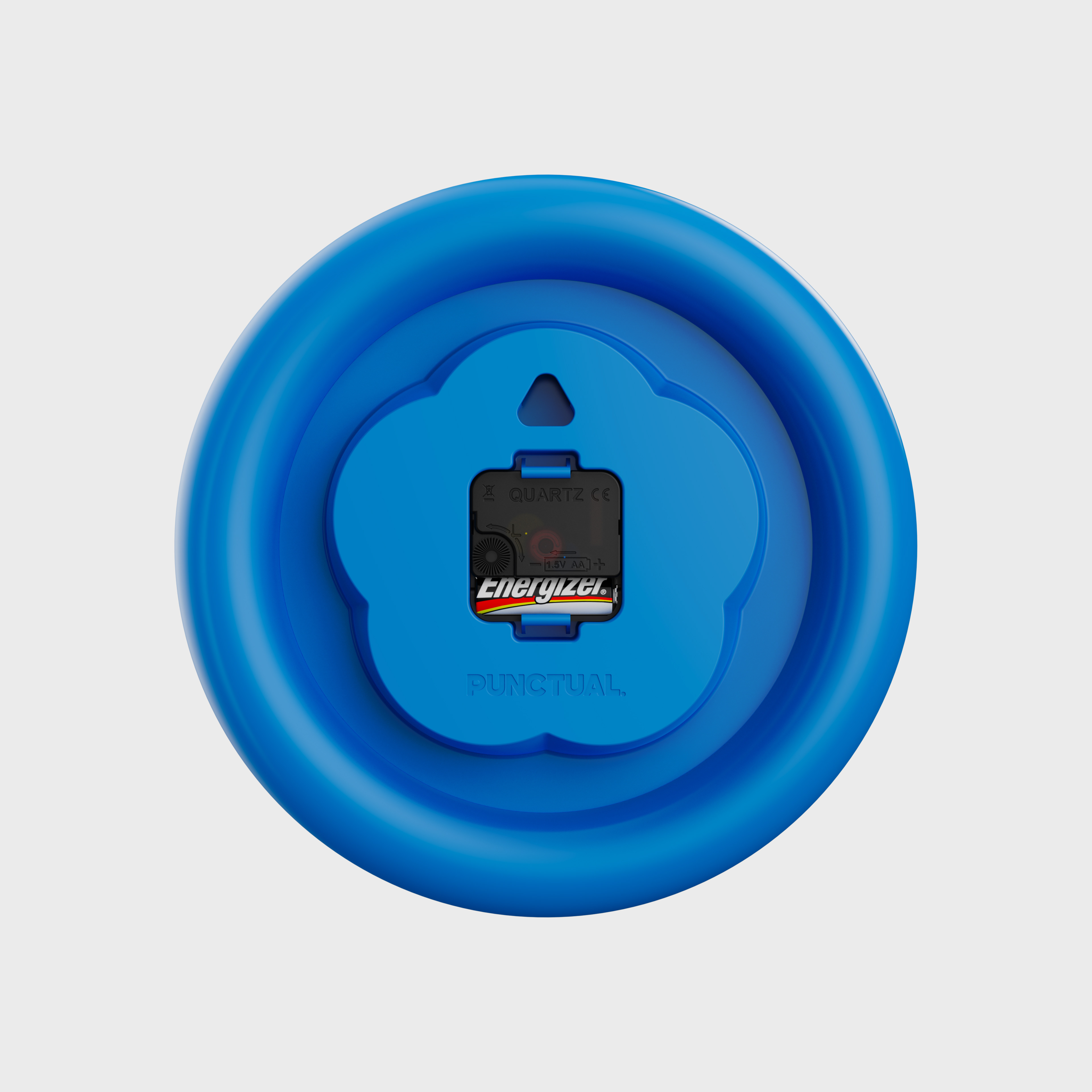
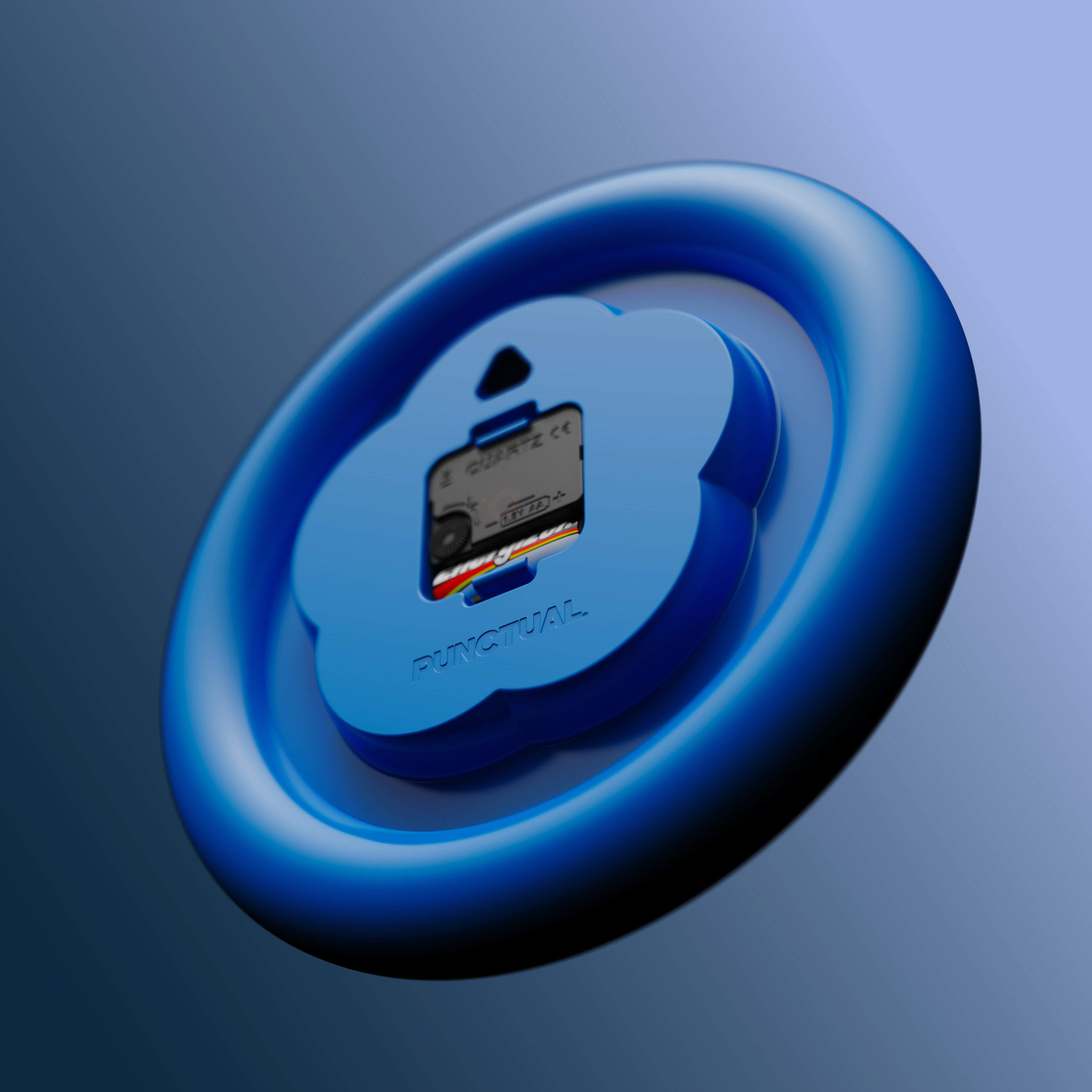
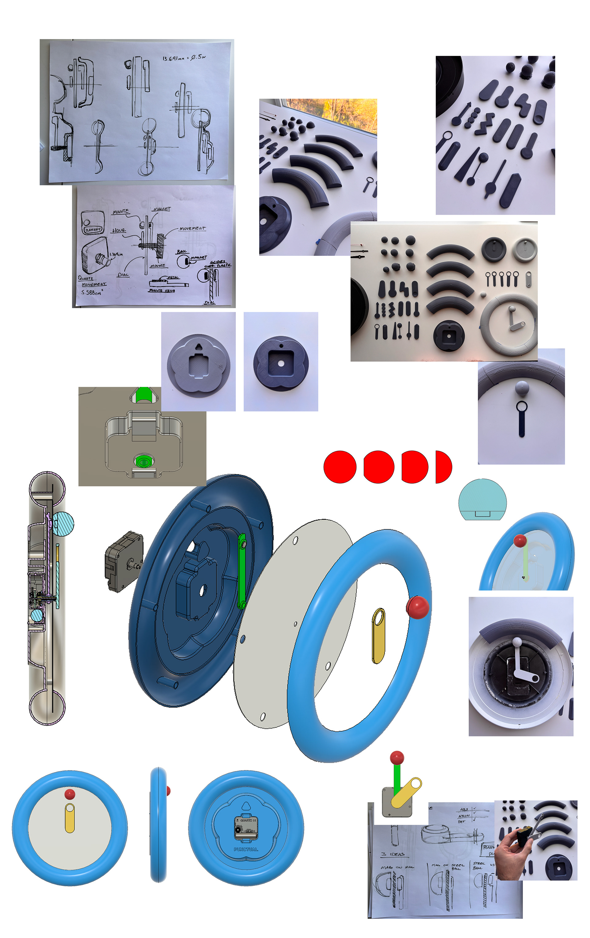
Materials: ABS, High Torque Quartz Movement
Dimensions: 40 x 40 cm
#RWClock
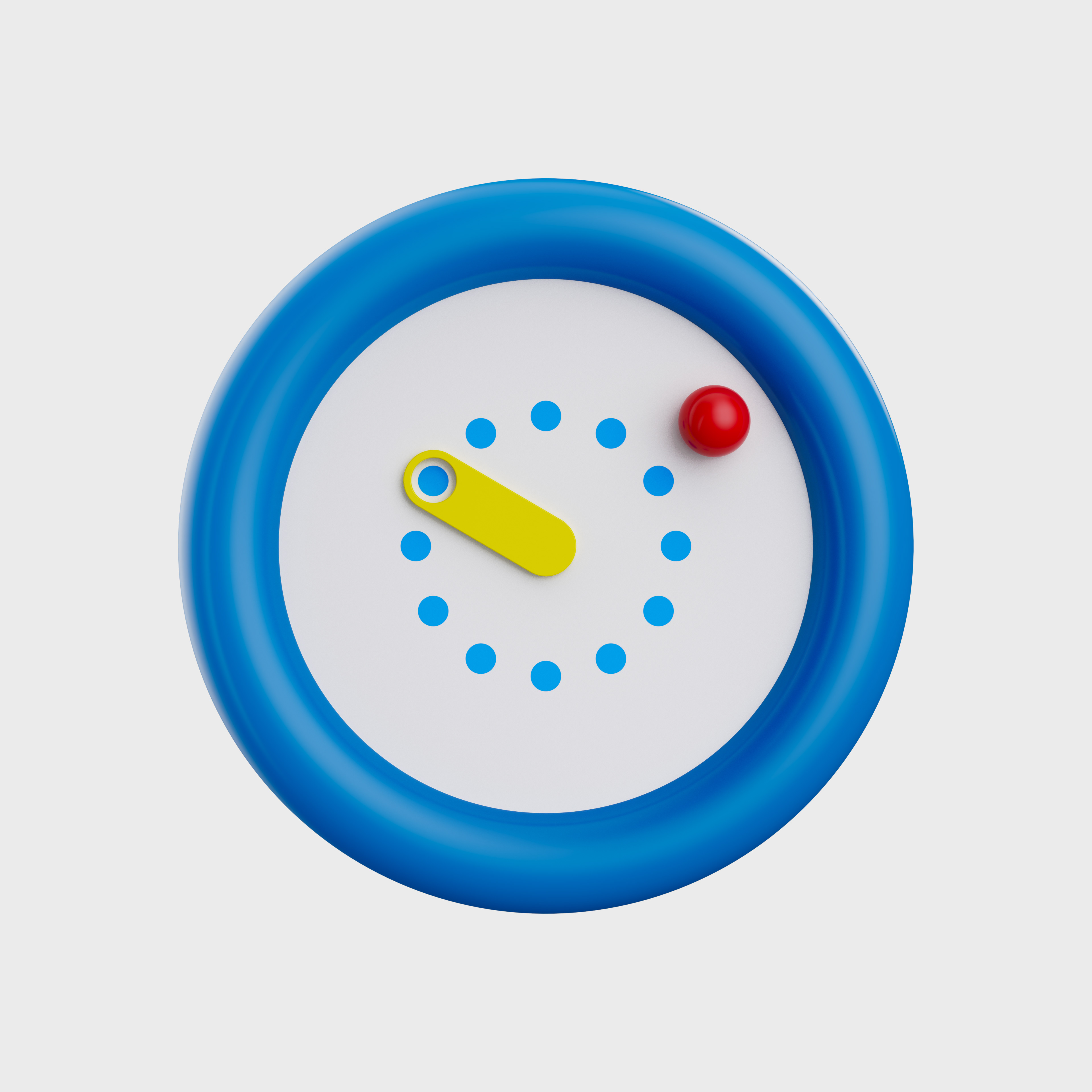
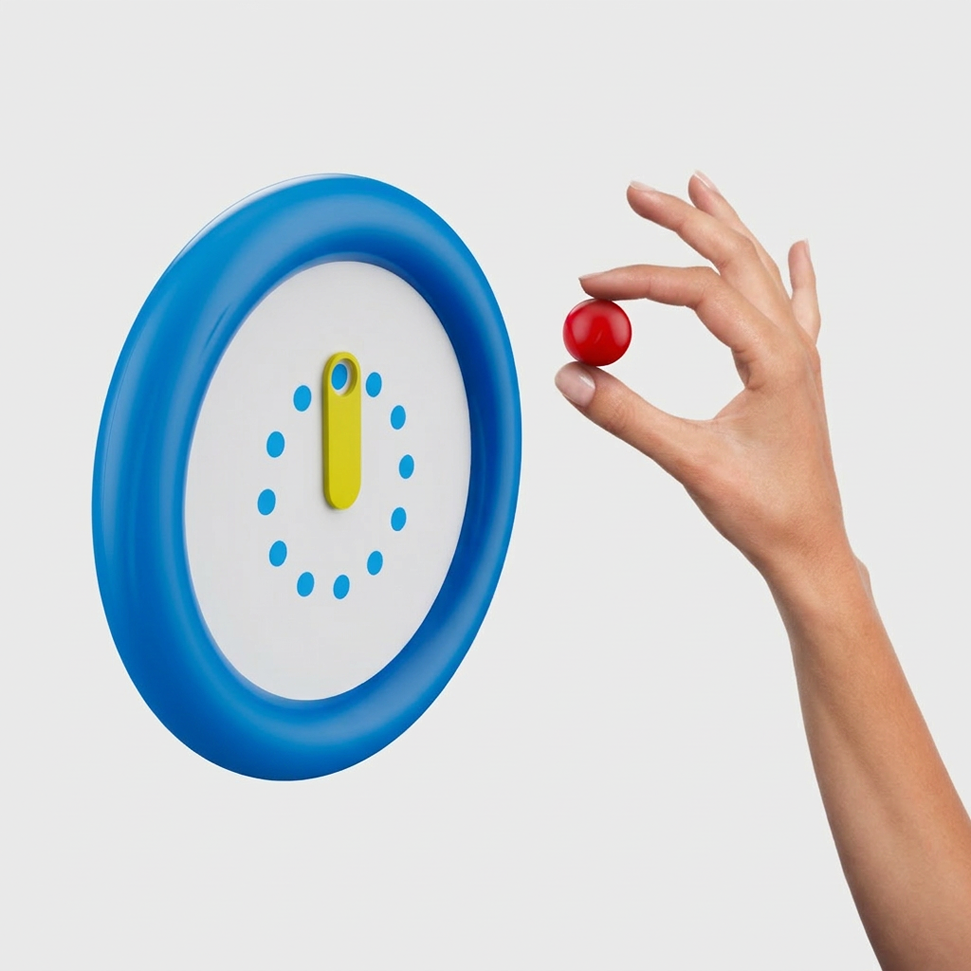
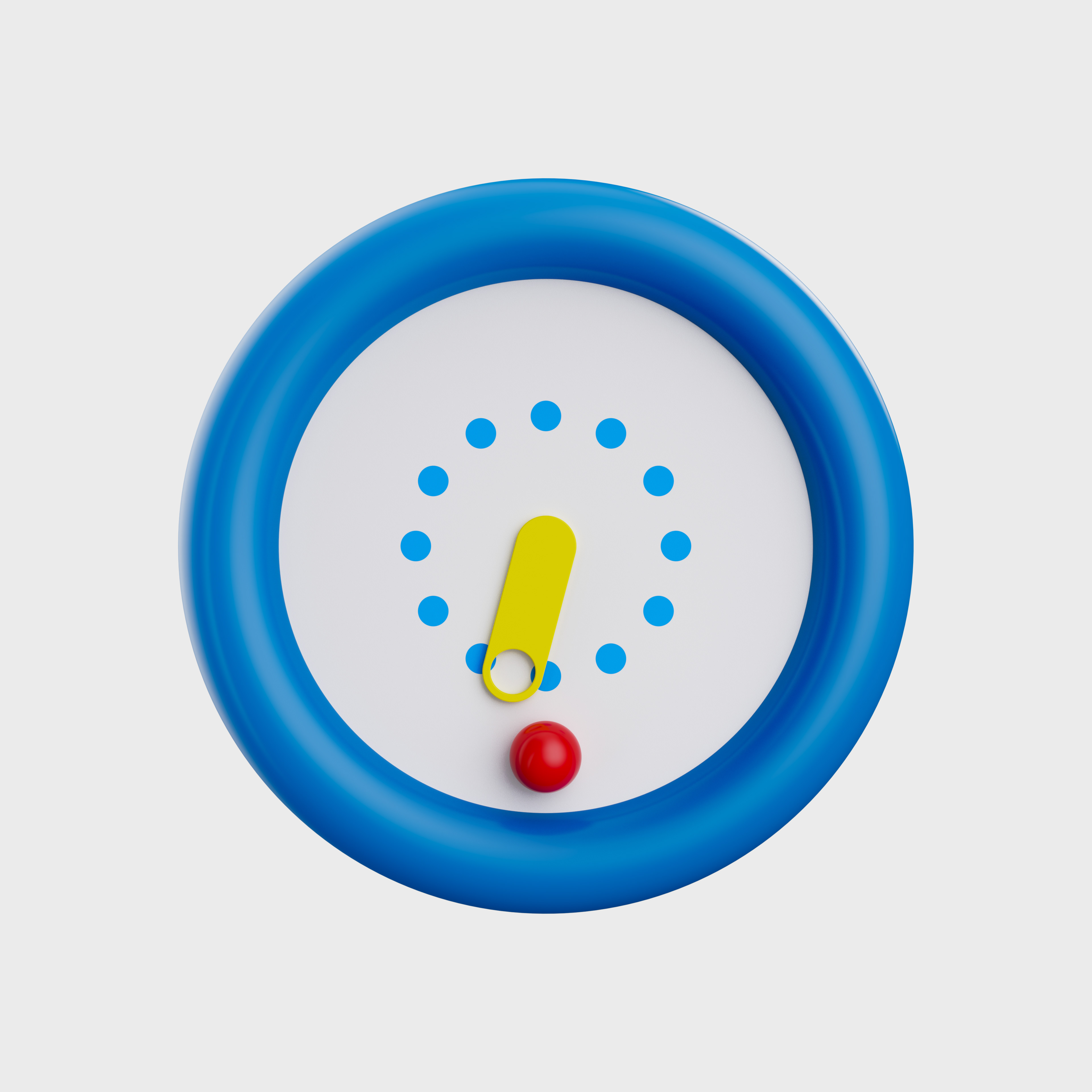
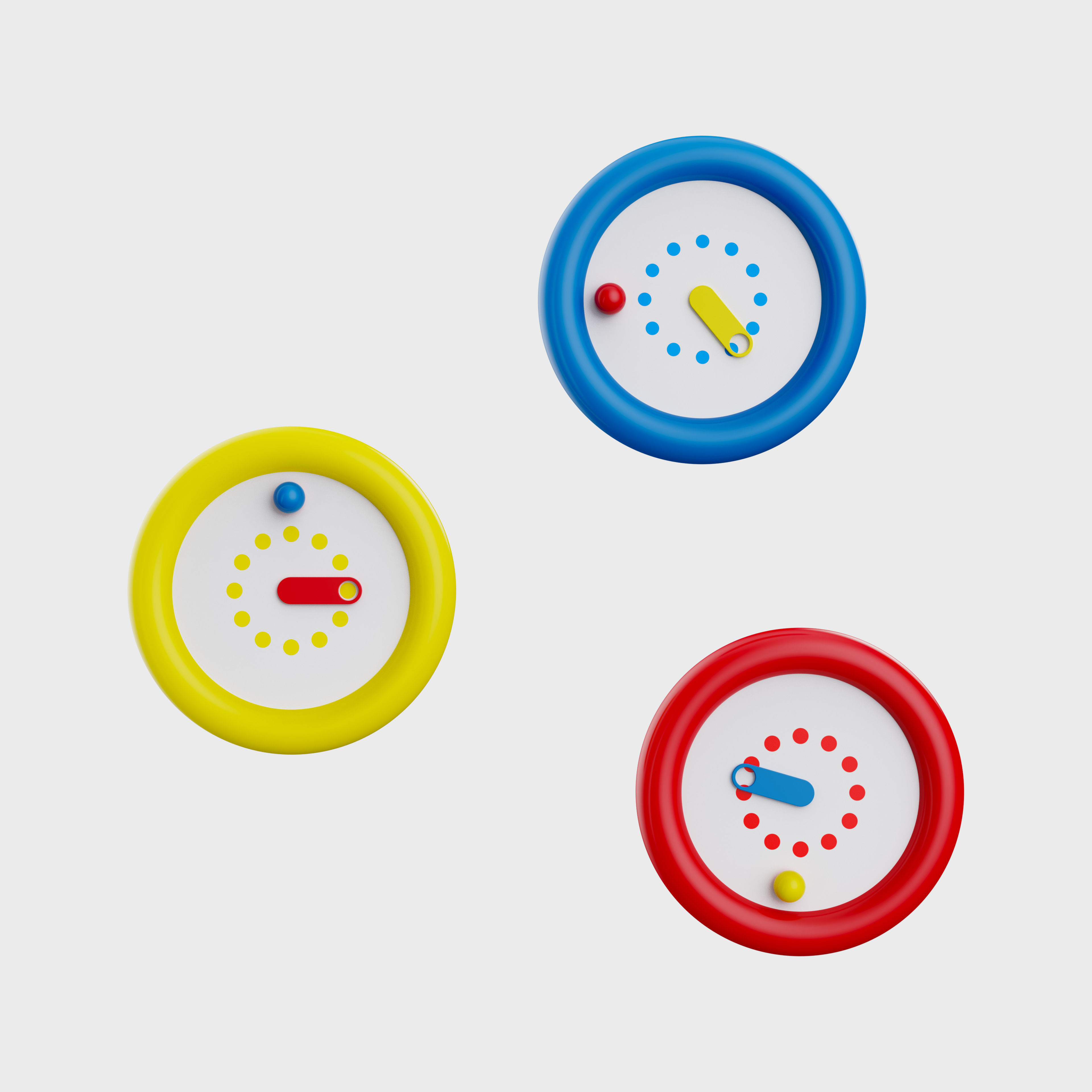
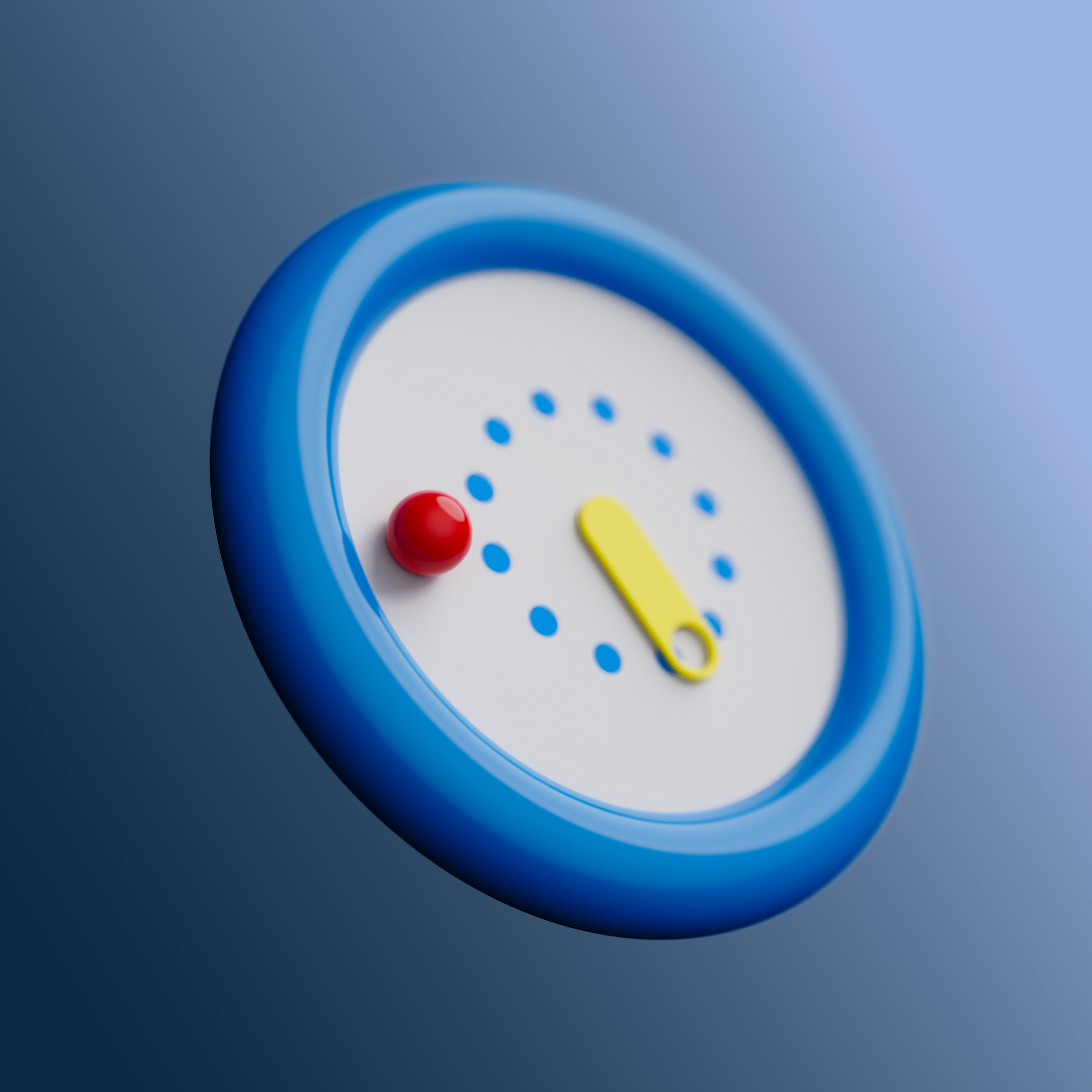
I was really drawn to the RenderWeekly prompt that called for a design of a clock. As someone who loves timepieces, I wanted to explore my passion through design. The goal was to create a timepiece that felt like a playful designer object. I wanted light and interaction to play a main role, while exploring a limited color palette. The result was a bubbly form with a minimally designed dial that uses a red dot minutes indicator and a yellow hour hand. The idea stuck with me so I set out to expand it a bit and add it to my studio space!
A Playfully Functional Clock
The guiding philosophy that pushed the design forward was having it be 'Playfully Functional.' I wanted the clock to not only spark joy, but be a curated object in someone’s space. The design is reminiscent of the Memphis Design movement with its simple geometry and bold use of primary colors. I wanted to lean into that style and make this an object that any interior designer or collector would love to have in their space.
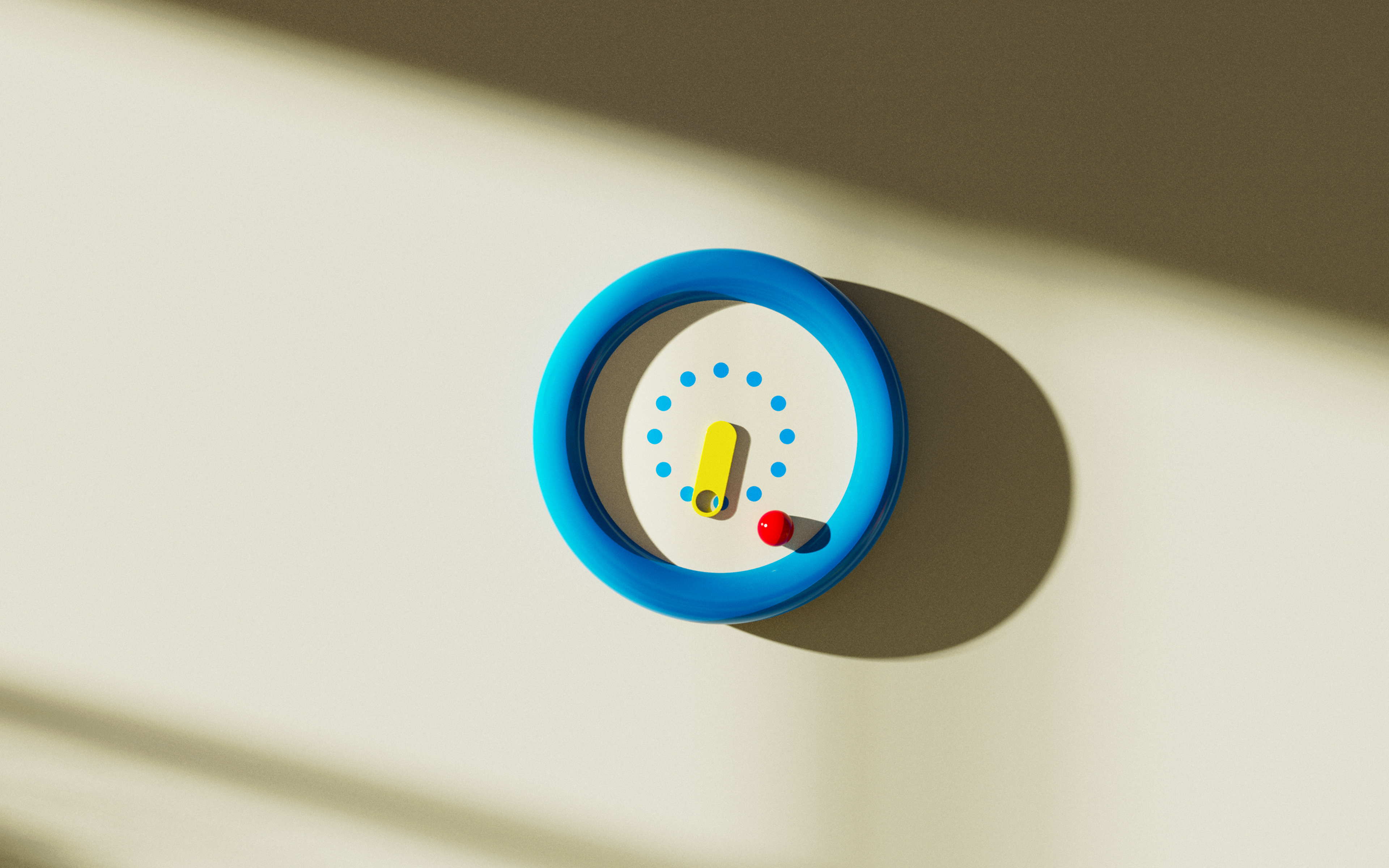
Dialing in the Details
Pushing the dial design meant solving for both clarity and character. The original concept was missing the immediate readability of a real wall clock, so I developed a range of face variations within a tight primary color palette, testing how far the design could drift toward "playful" without losing its function as a timepiece.
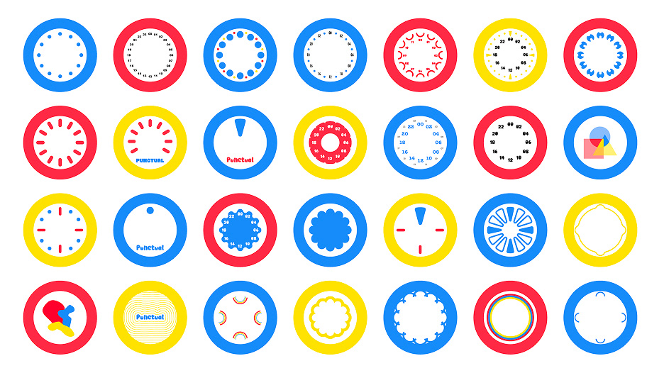
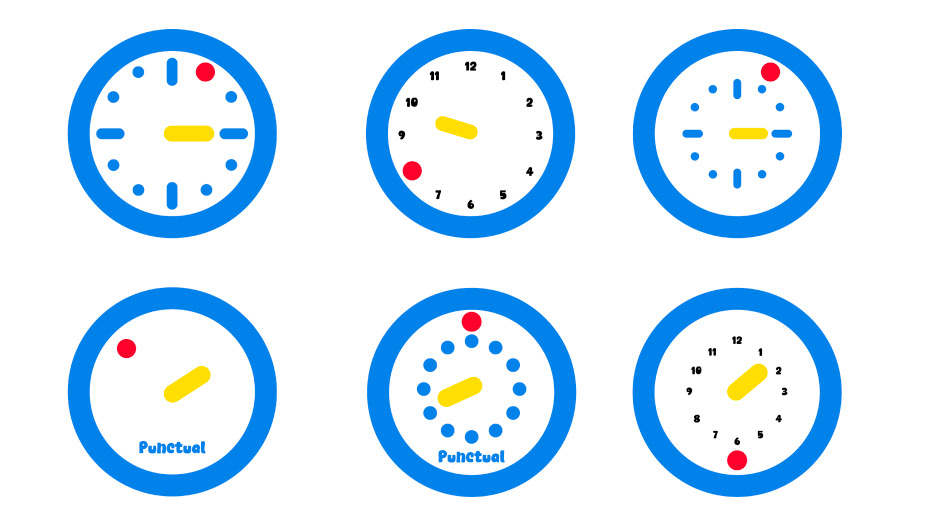
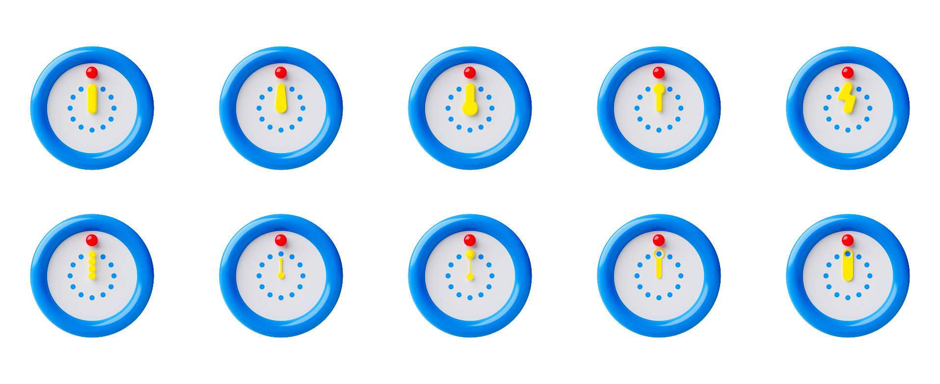
Striking the balance between Functional and Playful was always at the heart of the ideation. I wanted the clock to be readable but still hold on to the whimsy of the original direction. I knew I wanted some form of interaction between the minute hand or the hour hand. I settled on this dot design that would represent the hours on a clock. The hour hand has a hole that allows anyone to currently see what time of day it is as it hovers over the dots.